

Unlock Free Shipping on orders $100+ 🔓
Summer Sale! Celebrating America's 250th Enjoy 40% OFF Sitewide!
Wall Art Color Palette Guide:
Color Psychology & Room Color Matching
Color is the most immediate visual element of interior design, wielding the power to visually alter a room's physical dimensions and subtly shift the mood of its occupants. Selecting canvas wall art requires a deliberate understanding of color psychology and structural color matching formulas to avoid visual discord with your existing wall paint, flooring, and textiles. This comprehensive design manual breaks down the science of color theory, helping you use artwork to anchor your room's color story with professional accuracy.
Through our targeted design guides, you will discover how to apply classic interior rules like the 60-30-10 distribution formula, decode the psychological effects of warm versus cool undertones, and select canvas art that cleanly harmonizes with popular paint neutral palettes. Explore our structural color blueprints below to seamlessly balance your room's visual temperature and create a cohesive, expertly curated environment.
HOME / WALL ART GUIDE / COLOR PSYCHOLOGY & ROOM PALETTES
Ultimate Wall Art Guide
Color Theory Formulas, Tone Matching & Creative Room Psychology —
• The 60-30-10 Interior Design Color Rule • Matching Art to Neutral Paint (Gray, Beige, & Greige)
• Temperature Control (Warm vs. Cool Palettes) • Monochromatic & Tonal Art Styling
• High-Contrast Complementary Accent Art • Lighting Conditions & Canvas Color Shifting

The Proportional Design Trend —
How do you use the 60-30-10 design rule to choose canvas wall art color?
Applying the 60-30-10 interior design rule requires selecting canvas wall art that features either your 30% secondary color or your 10% accent pop color to tie the room together. In a standard space, 60% of the color comes from the walls and large furniture, 30% comes from rugs and textiles, and 10% is dedicated to accent pieces. Choosing a canvas that prominently mirrors that 10% accent color creates a cohesive visual anchor, pulling disparate decorative elements into a unified, balanced room design.

Canvas Curation for Neutral Walls
What color canvas wall art looks best on neutral gray or beige walls?
Choosing canvas wall art for neutral walls requires identifying the underlying warm or cool undertones of your gray, beige, or greige paint. Cool gray walls are best complemented by artwork featuring crisp blues, deep teals, and stark monochrome tones, which amplify the room's sleek, modern atmosphere. Warm beige and greige walls require canvas prints with earth-toned palettes, such as rich terracotta, soft olive green, and mustard gold, to maintain a cozy, balanced, and inviting living environment.

Visual Temperature and Room Psychology
How do warm versus cool color palettes in wall art affect room psychology?
The choice between warm and cool color palettes in canvas wall art directly dictates the energetic output and psychological mood of a room. Warm color palettes—utilizing reds, oranges, and deep yellows—stimulate social interaction, warmth, and appetite, making them ideal for high-traffic entryways, dining spaces, and kitchens. Conversely, cool color palettes—composed of blues, soft greens, and lavenders—lower cognitive stress and induce a sense of tranquil relaxation, making them perfectly suited for master bedrooms, home offices, and spa bathrooms.

Monochromatic Canvas Presentation
How do you style monochromatic and minimalist tonal canvas art?
Styling monochromatic and tonal canvas art relies on layering varying shades, tints, and textures of a single base color to create sophisticated depth without visual chaos. This technique works exceptionally well in minimalist, Japandi, or ultra-modern spaces where keeping a strict, uniform color story is critical to the architecture. When displaying a monochromatic canvas, rely on heavy brushstroke details, linen textile textures, or clean black floating frames to create essential contrast against a identically toned wall surface.
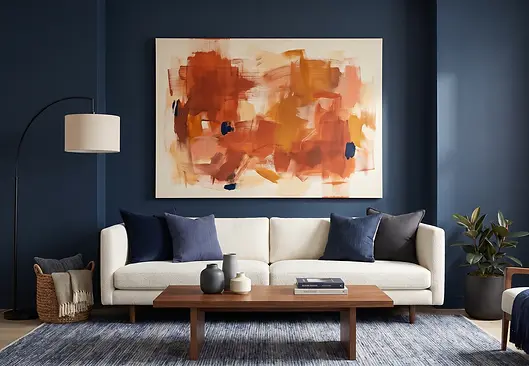
Complementary Color Contrast Strategy
How do you use complementary colors to make canvas wall art pop?
Making canvas wall art stand out requires selecting pieces that feature complementary colors sitting directly opposite your room’s dominant tone on the color wheel. For example, if a living room features navy blue furniture and textiles, introducing an abstract canvas highlighting vibrant burnt orange accents will create an instantaneous, high-contrast visual focal point. This intentional color clash creates dynamic visual energy, drawing immediate attention to the artwork and preventing the surrounding room design from looking flat or washed out.
Room Lighting & Canvas Color Shift —
How does room lighting affect canvas wall art colors?
Room lighting changes how canvas colors appear without changing the artwork itself. Cool daylight makes whites, blues, teals, and grays appear crisper, while warm 2700K LEDs enrich creams, ochres, corals, and terracottas while slightly muting cooler hues. Evaluate artwork under the lighting used most often and choose high-CRI bulbs for more faithful color rendering throughout the room.
